

BRANDING YOU. BY DESIGN.
Websites.
Great website design is not just about how it looks to you—it's about how it works for them. A website is your brand's 24-7 digital storefront, and every detail matters. It should be both intuitive, and beautiful, creating an experience that feels effortless for the user and welcomes every visit. A great design doesn't just showcase your products or services—it should communicate your values, builds trust, and leave a lasting impression. Regardless of size or scope of your website, simplicity, clarity, and elegance are key, but more so the unrelenting pursuit of care and visitor focus. When your website is designed with purpose and fine attention to detail, it becomes more than a tool—it clearly becomes an extension of your brand's story.
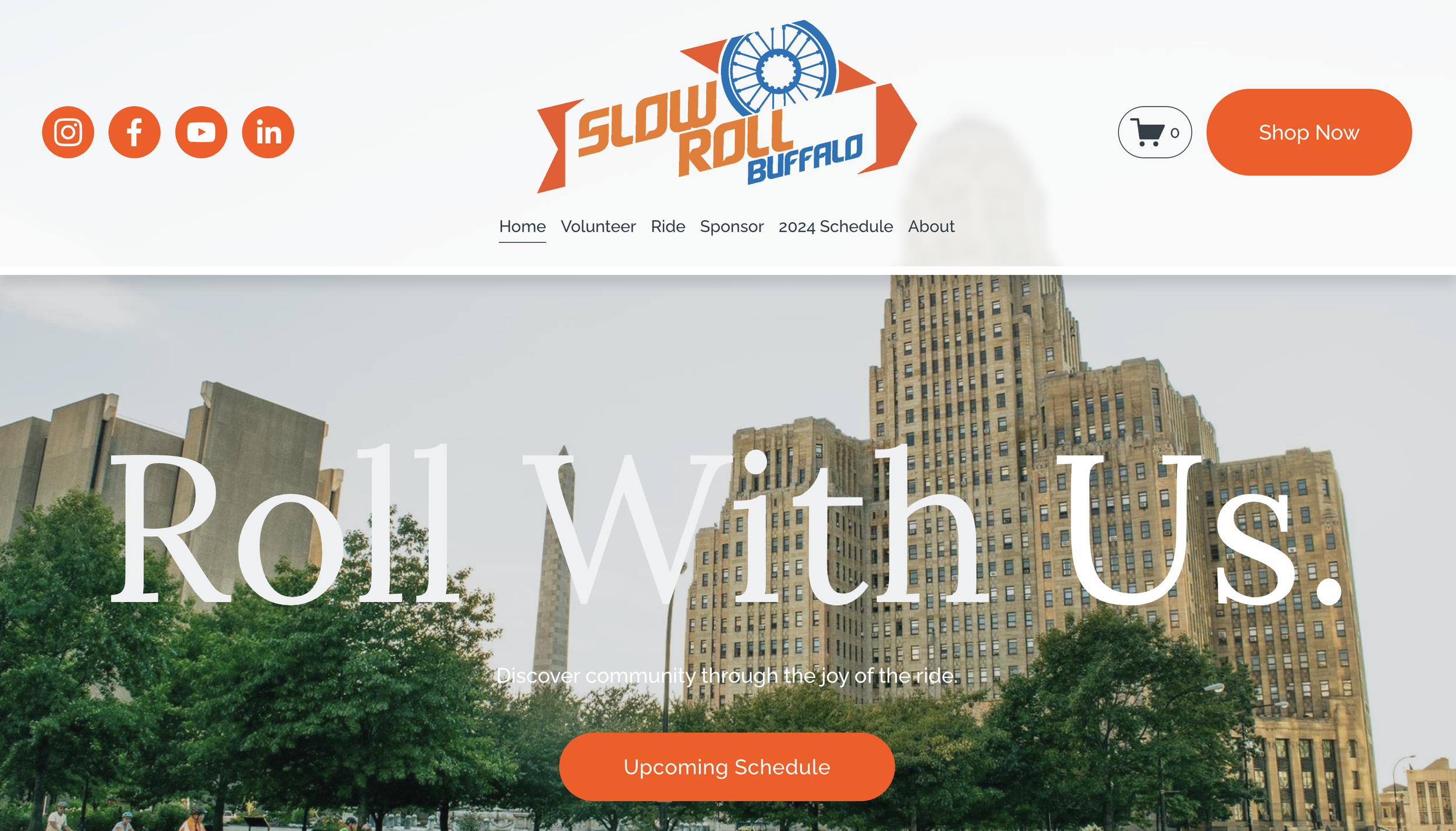
COMPACT.
EFFICIENT scalable sites
The Speed OF simplicity.
Simplicity and elegance many times define approach. With compact websites, the idea is to engage visitors in a seamless journey, deliver a concise and impactful message, offer streamlined navigation, ensure mobile optimization, and ultimately drive higher conversions.


Unlock success for your brand with the power of speed and simplicity.
SHOWCASE.
FULL MULTI-PAGE WEBSITES
POWER YOUR BRAND.
Allow for larger content organization, and provide the flexibility to expand your offerings with dedicated sections, unveiling the depth of your business, and harnessing the benefits of optimizing individual pages for search engines.


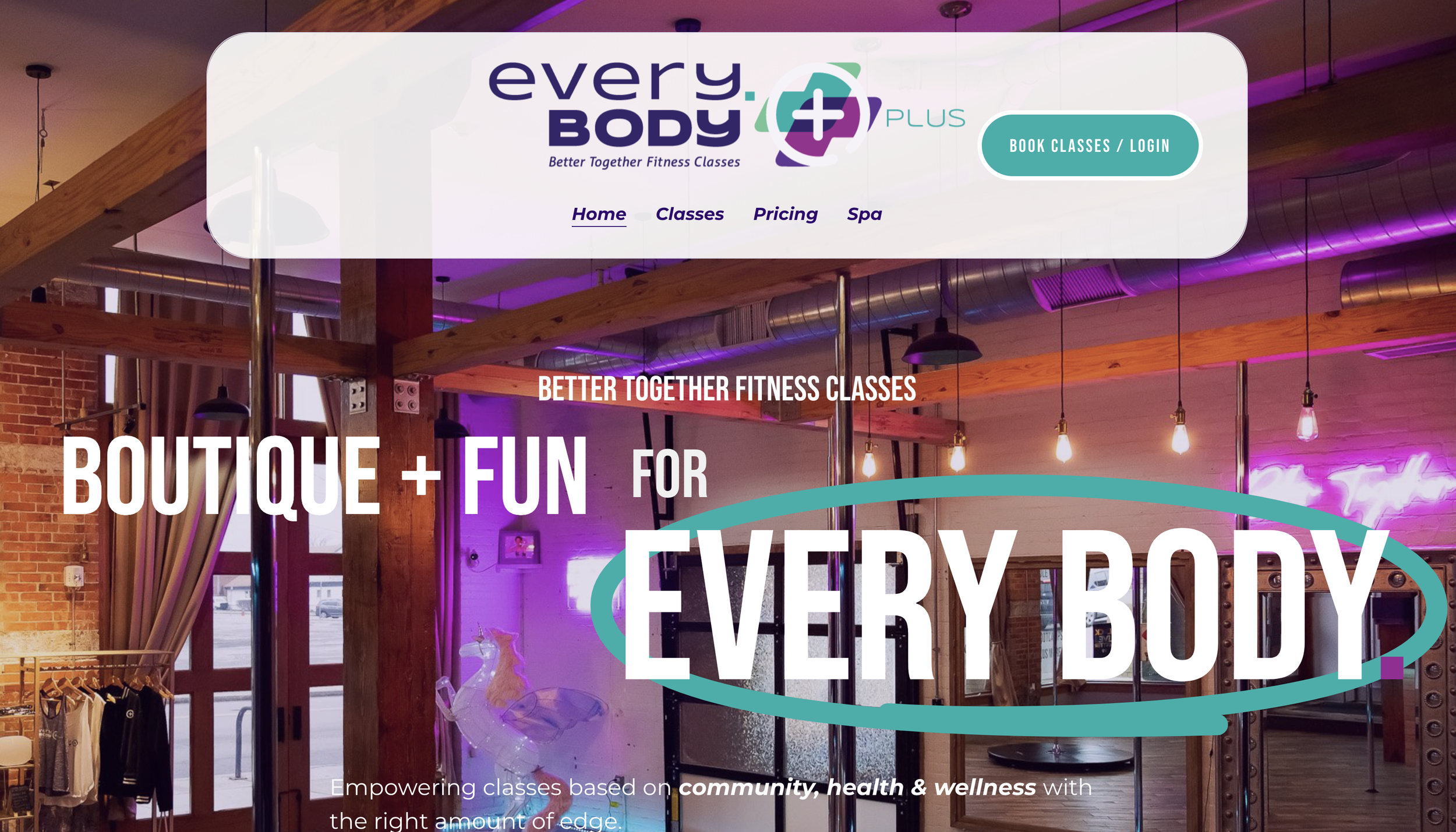

Connect your brand with the full scope of a multipage business website.
ADD-ONS
ADD-ONS
COMMERCE.
DYNAMIC E-COMMERCE WEBSITE
TRANSFORM YOUR ONLINE STORE.
Strengthen your online presence with thoughtfully designed navigation of your products or services. Secure payments, track orders, and streamline your checkout to build customer trust, all while being optimized for mobile to reach customers anywhere.
Transform your store and boost sales while staying on brand with simplicity and elegance.
SCHEDULE.
CLIENT BOOKING SYSTEM
Streamline AND MANAGE YOUR AppointmentS.
Customize your appointment availability for client convenience, automate reminders to reduce no-shows, all seamlessly with your website. Whether for consultations, classes, or events, we modernize your bookings, letting you focus on what you do best.
Streamline your scheduling today, your future clients will thank you.
PAY WALL.
EXCLUSIVE MEMBERSHIP ACCESS
monetize your content effortlessly.
Offer exclusive content to your dedicated audience and build a community of loyal subscribers while generating revenue. Easily manage subscriptions, provide tiered access to premium content, and engage users with personalized experiences.
Elevate your brand and turn passion into profit by creating a compelling space for your favorite followers.
LEARNING.
LEARNING MANAGEMENT SYSTEM
IGNITE KNOWLEDGE AND GROWTH.
Create engaging online courses with ease. We can help structure your lessons, and provide simplified integration for progress tracking, with email automation all in an immersive learning experience tailored to your visitors.
Motivate your audience to learn, grow, and succeed, one course at a time.
